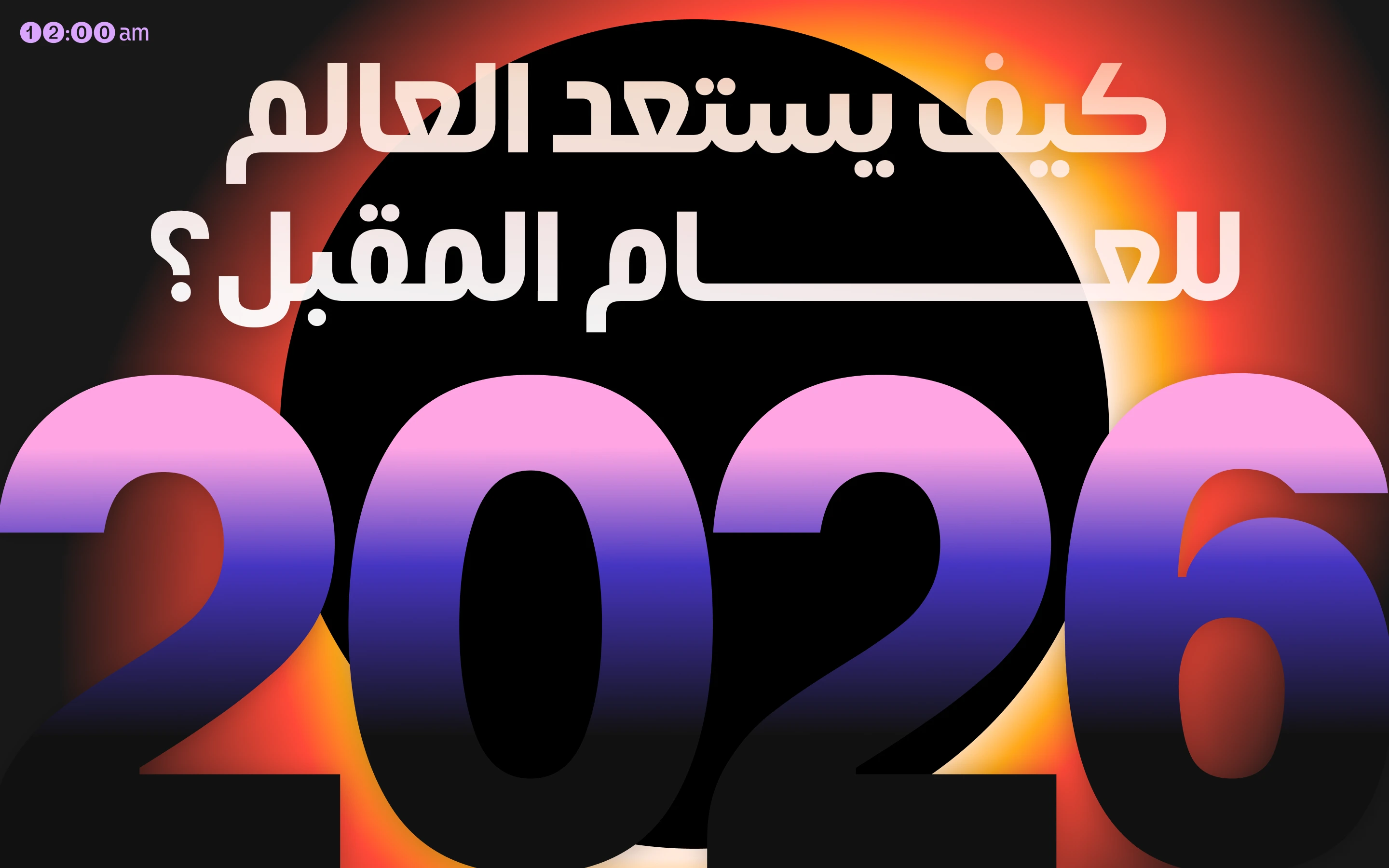
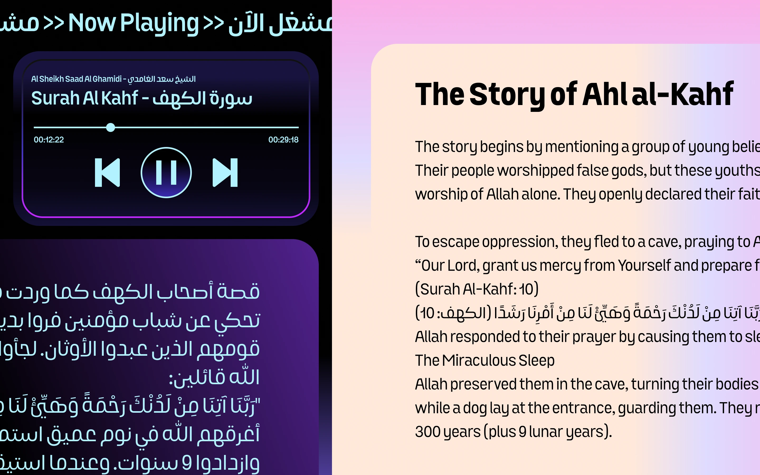
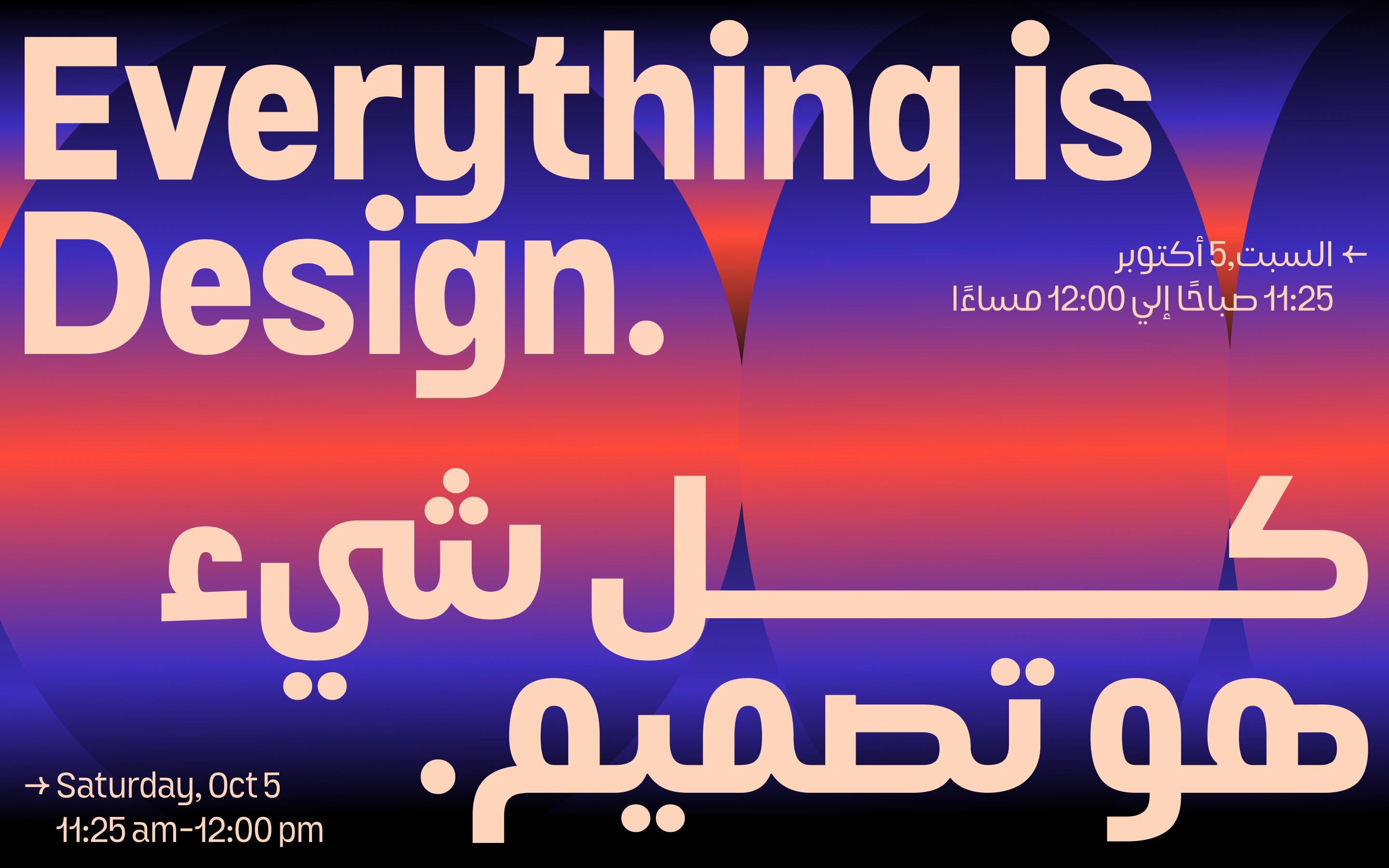
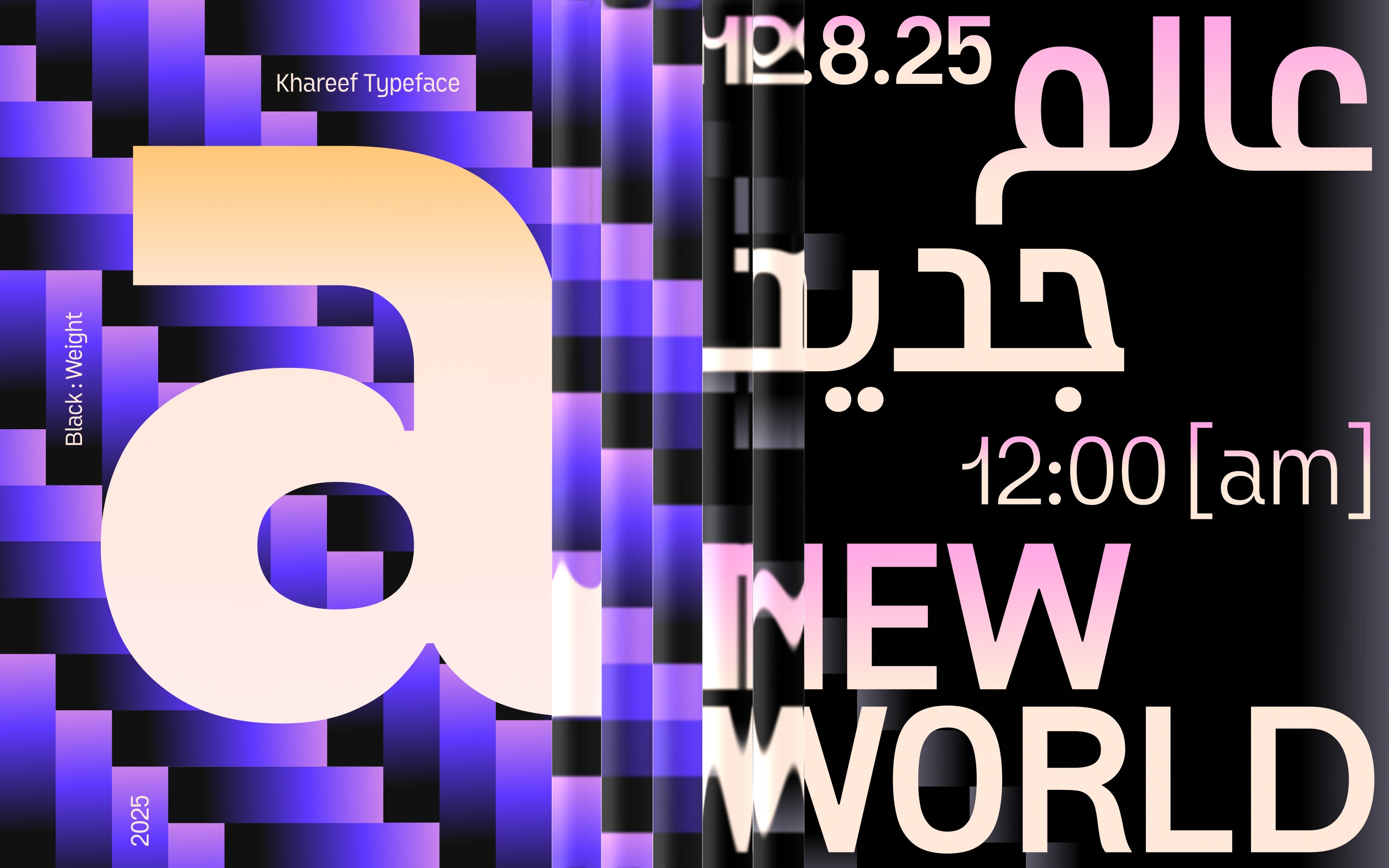
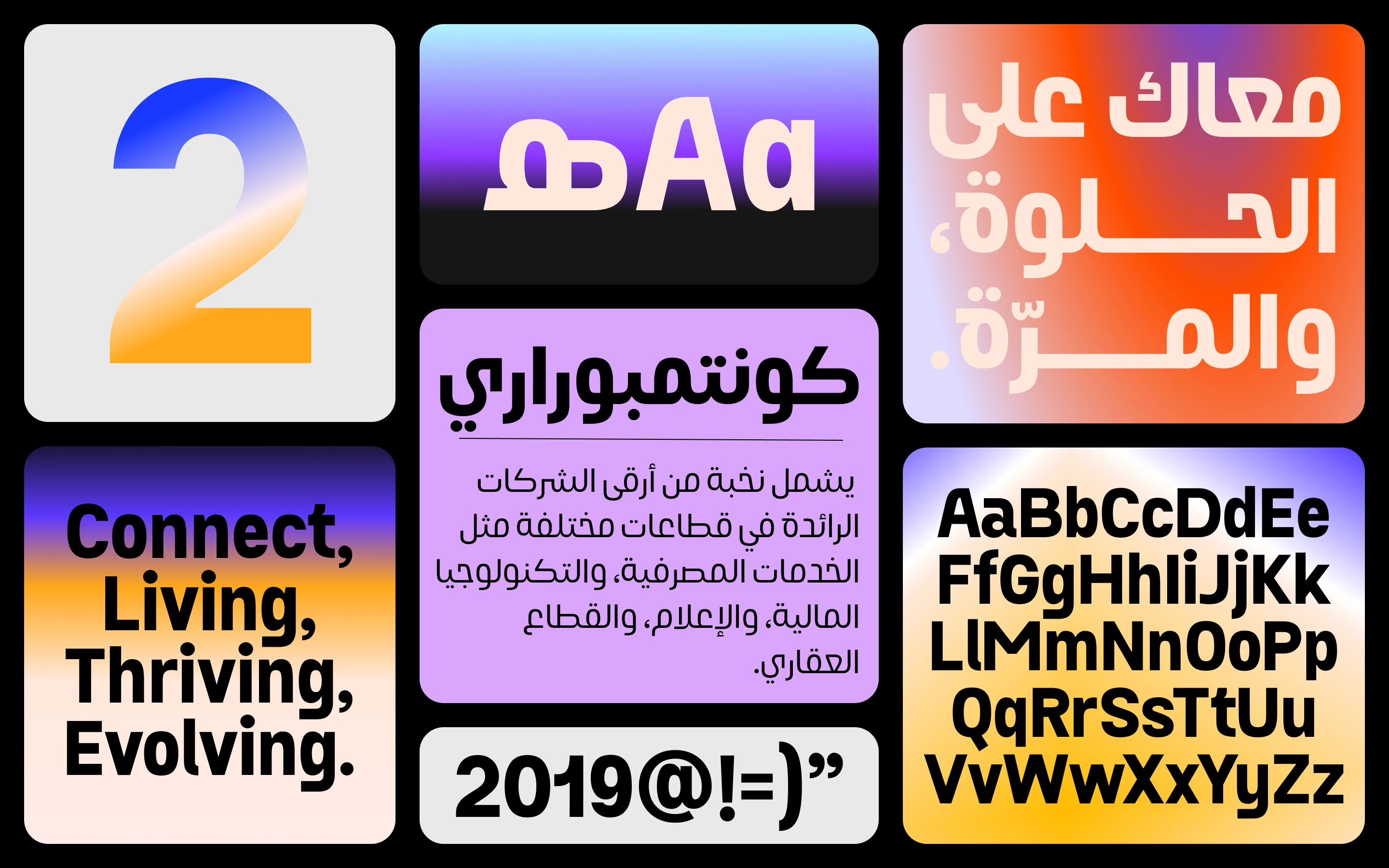
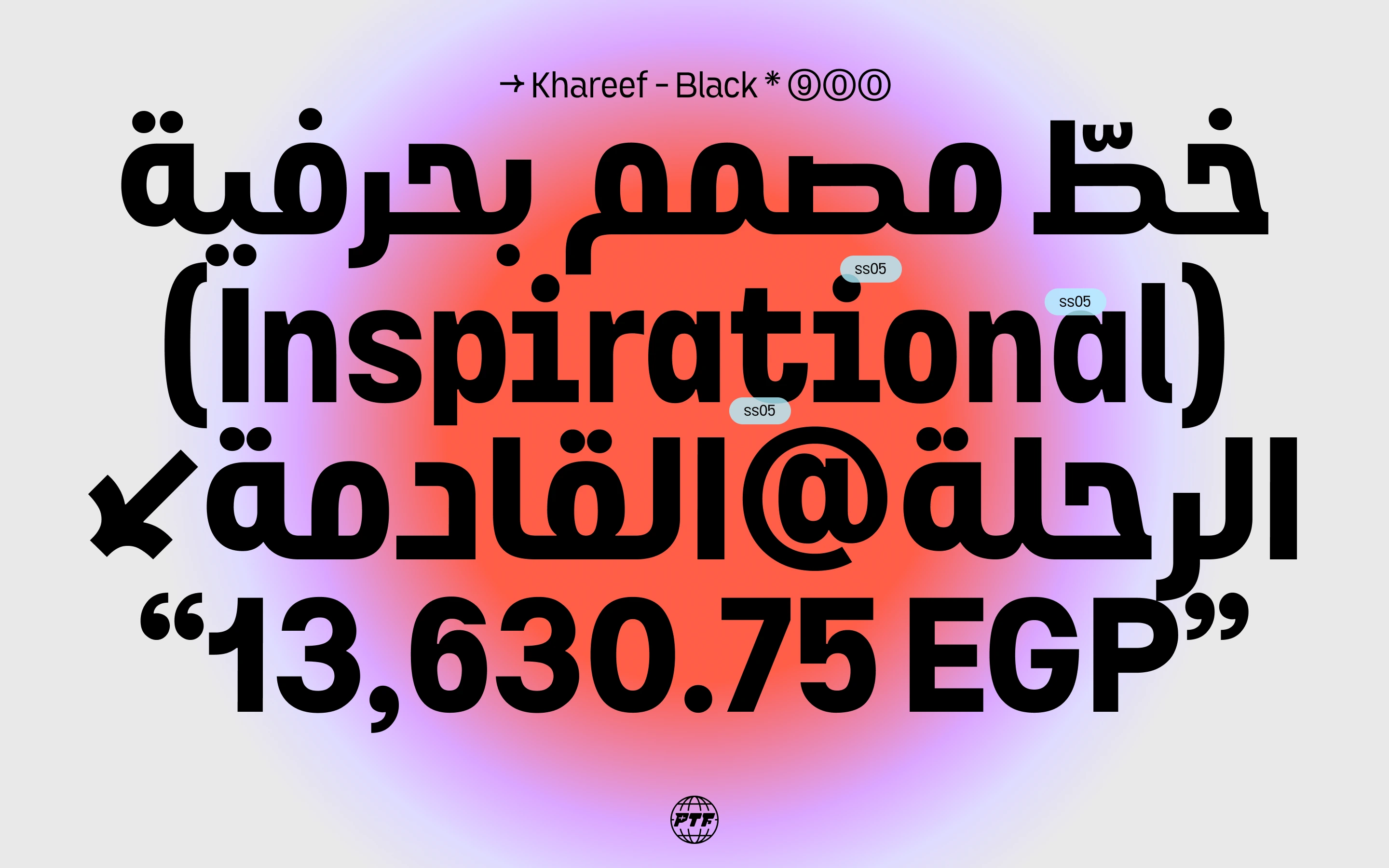
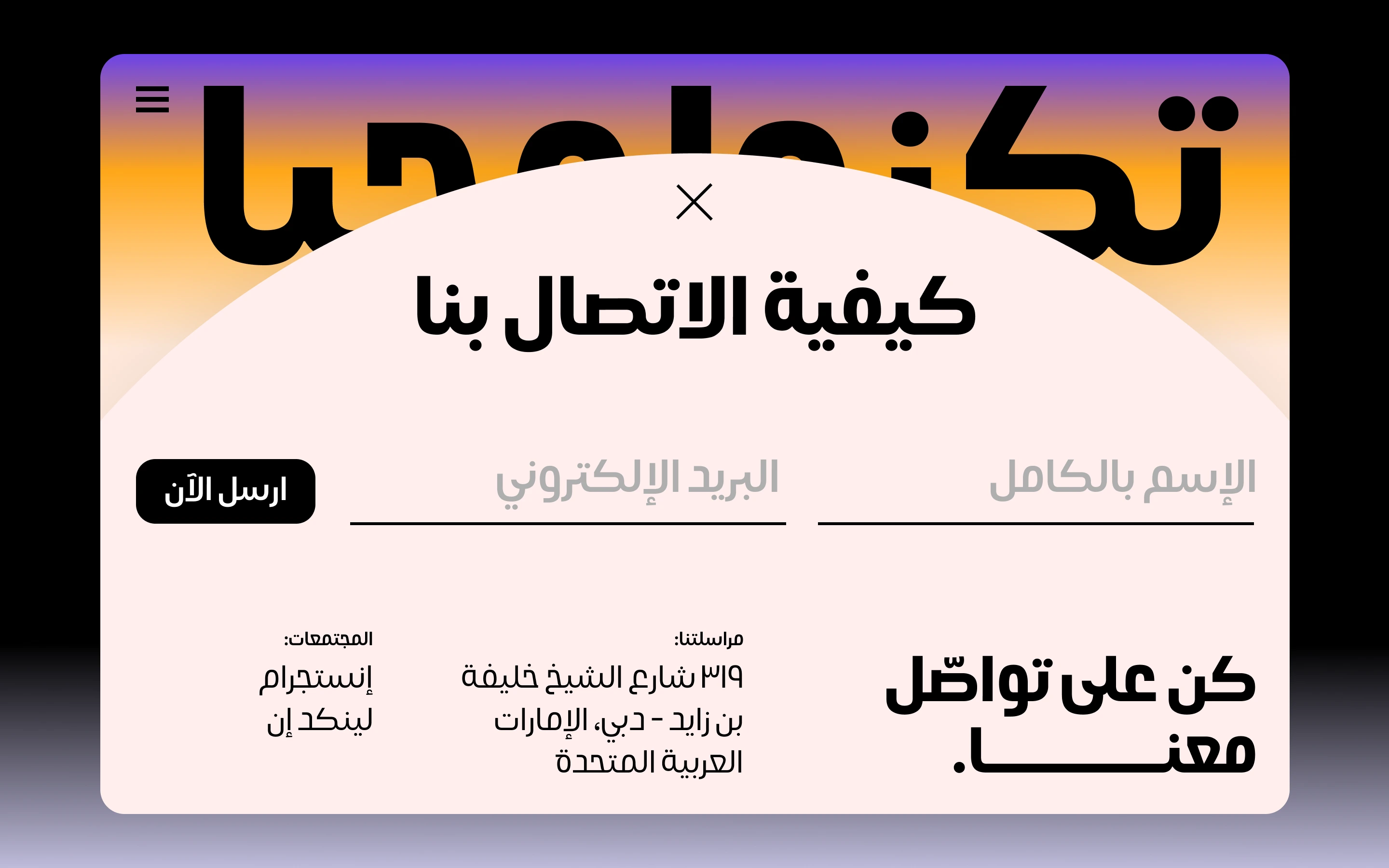
Khareef (Autumn) is a multilingual contemporary grotesk built to bring Arabic and Latin together in one coherent typographic voice. Its Arabic forms take their starting point from traditional Kufic construction, then reinterpret that structure through modern geometry, generous curves and carefully controlled proportions. The result combines clarity with a distinctive personality that feels equally natural in branding, editorial work and digital environments.
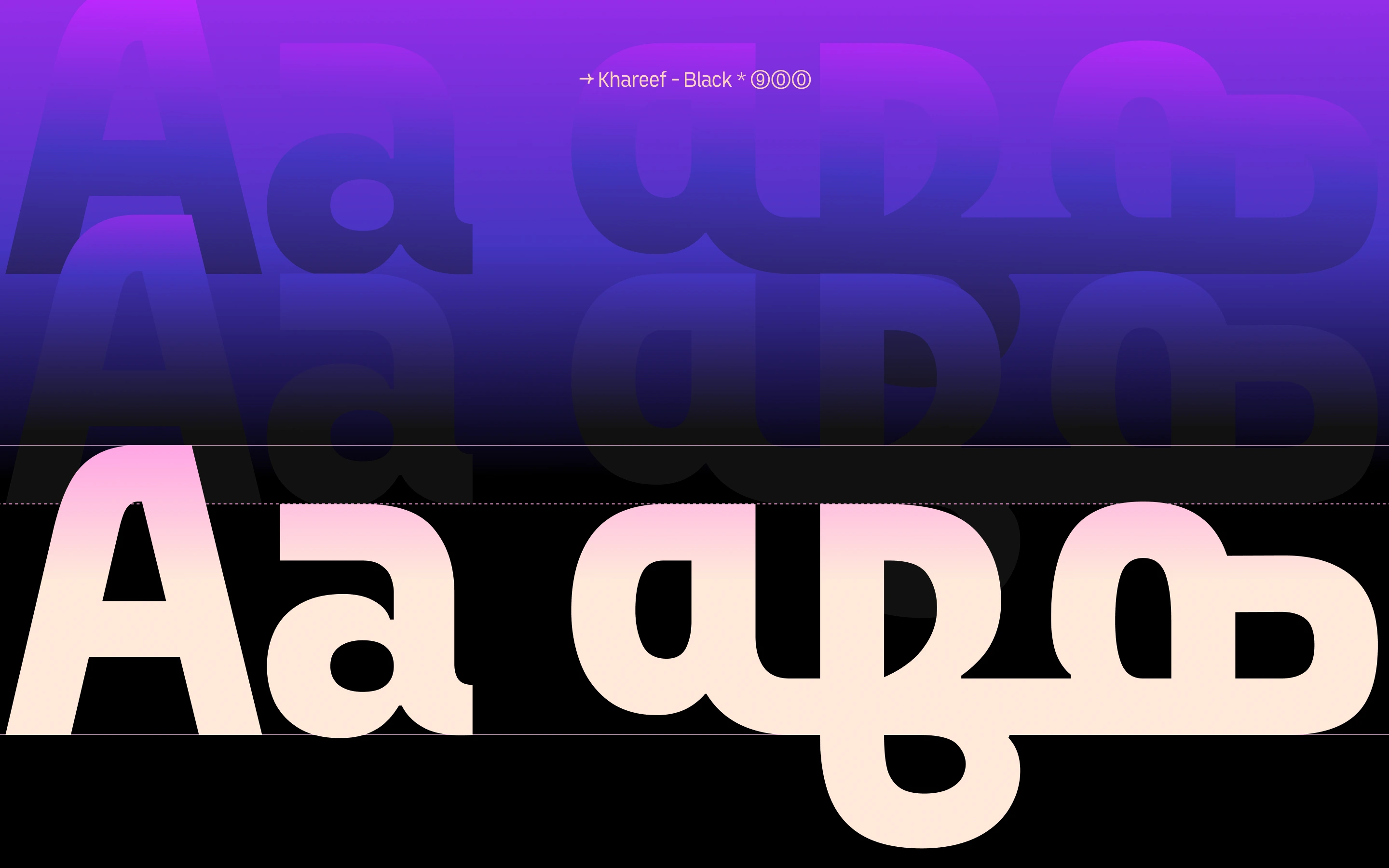
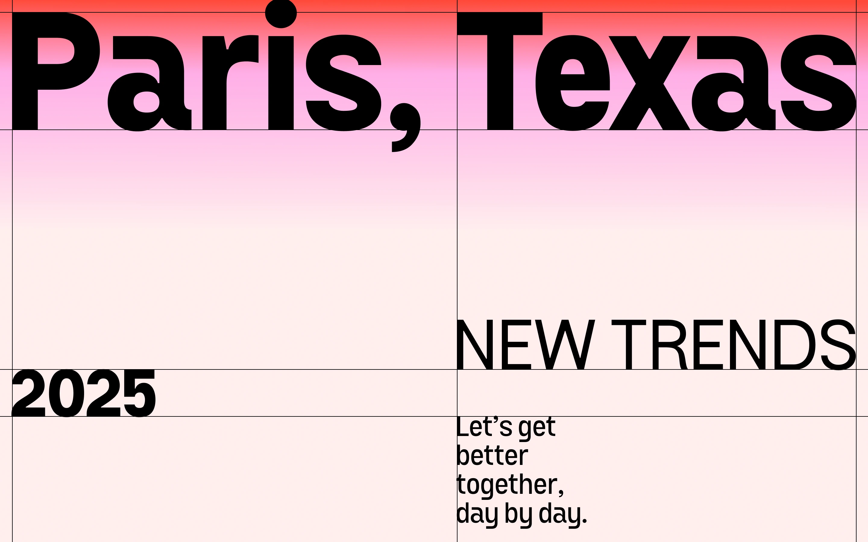
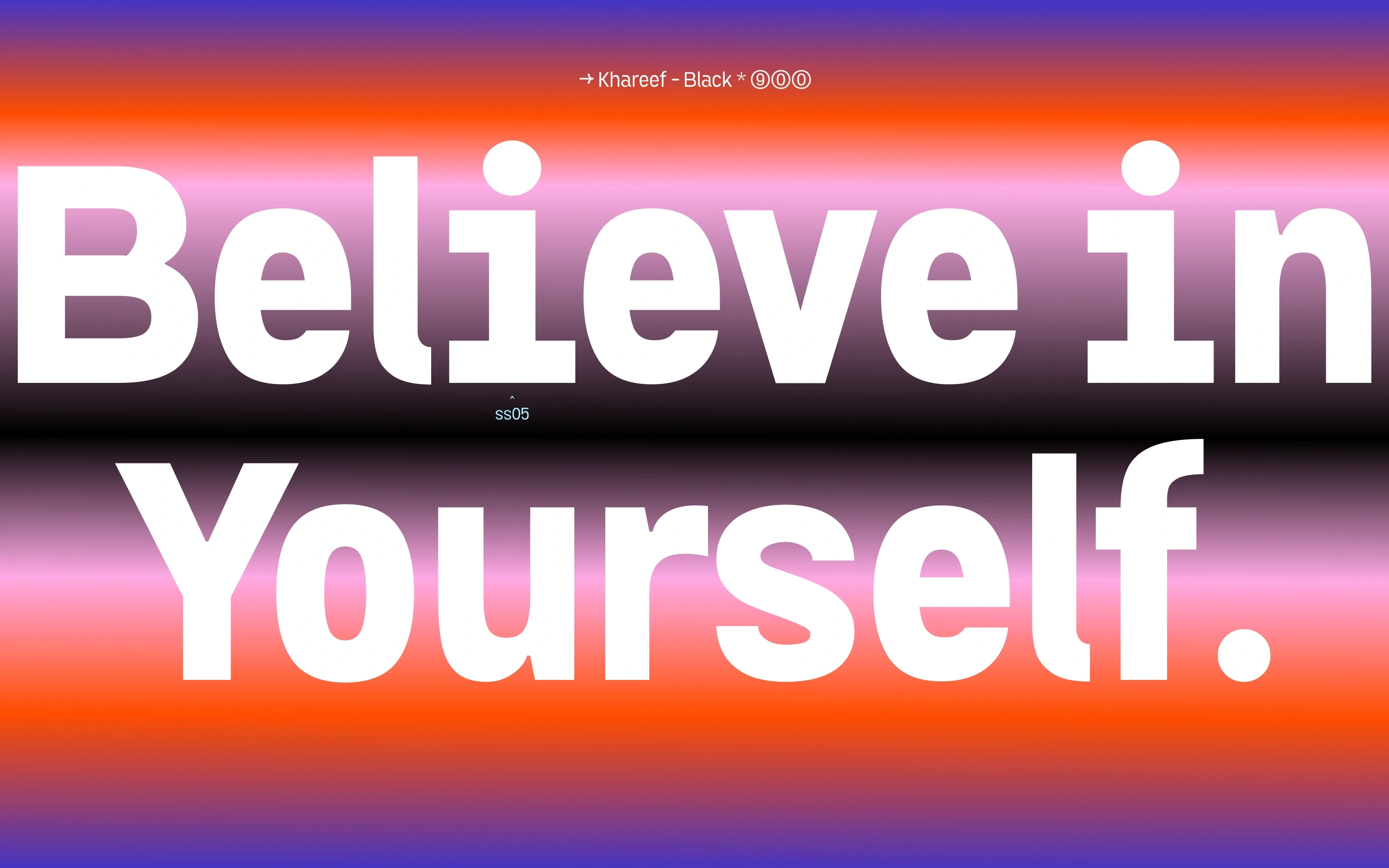
A key characteristic of Khareef is the tension between compressed and wide forms. Rounded, open shapes sit beside tighter constructions, creating a lively rhythm across words and headlines. The heavier weights were refined for strong legibility and presence, while stylistic alternates give designers more expressive options without breaking the consistency of the family.
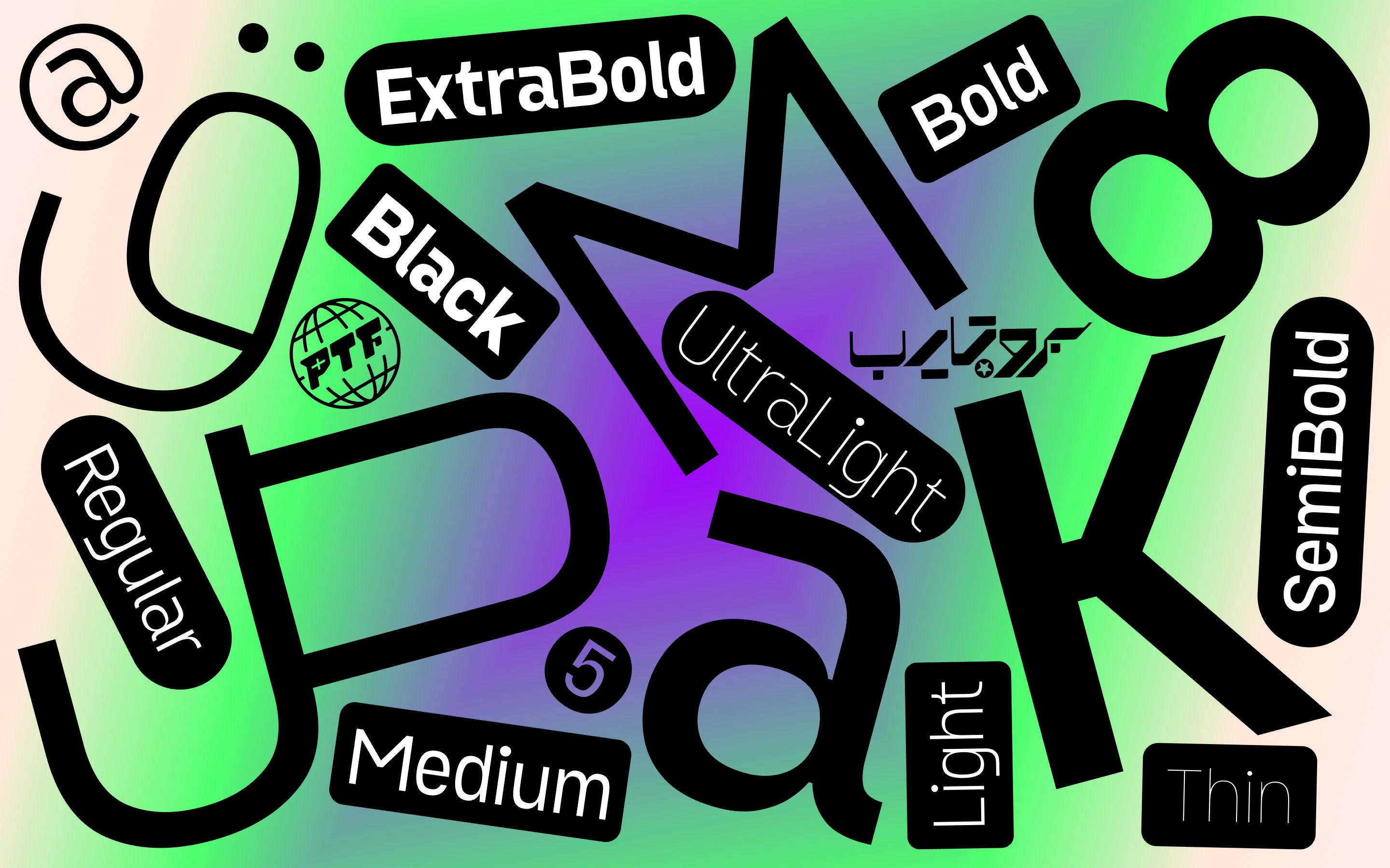
Khareef is designed especially for headlines and short text, but its broad range makes it useful across identity systems, campaigns, interfaces, packaging and contemporary editorial layouts. The family includes nine static weights and, with the full family, a two-axis variable font that controls both weight and width.
The character set supports Arabic, Latin, Kurdish, Persian and Urdu and covers more than 90 languages. Khareef was designed and developed by Ibrahim Hamdi between 2019 and 2025 for Protype Foundry.